Have you ever found a rug design you love only to hesitate because you wonder if its colours will work with your sofa or feature wall?
Don’t worry: it’s a common source of doubt. And it makes sense, as a rug occupies such a large visual area. It can have a massive effect on how a room looks or how its parts come together.
The good news is that you don’t actually need a perfect match for every piece of decor in the room. The aim when styling a room and choosing a rug is to get a palette that shows clear relationships with what’s already there.
That starts with you knowing what you have before you even start to look at rug design ideas.
Start With the Room’s Existing Anchors
The first step is to look at the least flexible parts of the space, i.e. the items that are hardest to change. Examples of these are the sofa, flooring, wall paint, and built-in cabinetry.
Try to identify two or three colours in them. At the very least, you want to find a dominant colour, for example, or a secondary tone.
The rug you choose doesn’t need to repeat all of those colours. You only need to pick up one or two of them to create the visual link that makes your choice feel deliberate.
If you have a warm cream sofa and timber flooring, for instance, fitting rugs might boast colours such as sand, terracotta, or even muted olive. Those hues tend to echo cream and wooden colours, keeping your furnishings connected.
Decide What Role the Rug Should Play
Choosing a palette is easier once you’ve determined if it should serve as a quiet foundation or the room’s statement piece. Which purpose do you want it to serve?
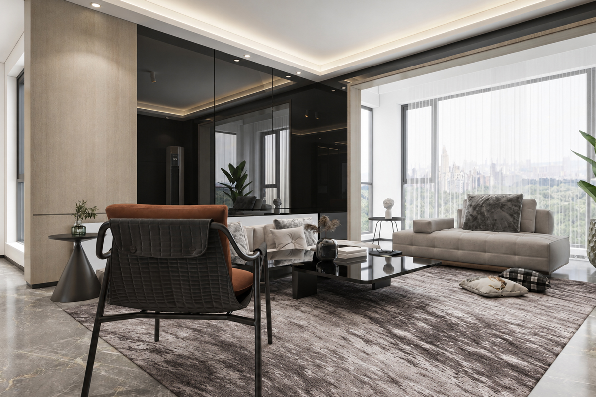
If you already have mostly neutral decor in your HDB or condo, you may want to make the rug the defining moment in your furnishings. It may bring in a controlled hit of colour to elevate everything and inject energy into the space.
If the room already has bold artwork or patterns, on the other hand, you may want to opt for a rug that offers more restraint. It could eschew brighter colours in favour of calmer undertones (we explain these below). This lets the existing statement pieces breathe instead of competing with them.
Look Past the Main Colour
Undertones are secondary hues sitting beneath a colour’s surface. They’re responsible for the difference between a grey that seems warm (it may have beige beneath it) and one that reads cool (it may have blue beneath it).
Two rugs can look nearly identical in a photograph and then feel completely at odds with each other due to undertones. That’s why something like a cool grey rug can sometimes seem disconnected to cream walls or honey-toned timber.
Contrast can work, of course. Warm timber with a cool blue rug can be an effective pairing. However, it reads best when a warm accent colour elsewhere in the space actually pulls everything together quietly.
Consider How Light Affects Colour
Light conditions can affect colour more noticeably than most people realise. A west-facing living area gets a warm and golden afternoon light. A bedroom on a lower floor or facing in a different direction will often have cooler and more diffuse light for most of the day.
Never make a final decision on a rug based on a screen image or showroom display alone. Colours that look right on a monitor can shift under your home’s actual lighting conditions.
Check a swatch in your space and do it at different times of day. A tone that looks right at noon can read quite differently under warm evening lamps or the cool blue light of the early morning.
Use Colour to Shape the Feeling of the Room
A rug palette does a lot of atmospheric work, so it pays to think about the feeling you want to achieve before you settle on anything.
Here are some general practical rules that can help:
- Muted blues, greens, and cool greys are great for bringing a calm quality into a space. For this reason, they work well in bedrooms and home offices.
- Cream, sand, taupe, and earthy tones offer a lot of versatility. They also tend to age well across many furniture styles.
- Deeper navy, forest green, charcoal, or wine are effective at giving a room depth. It’s useful when you need an anchor or something to add definition to neutrals.
- Multicoloured palettes come into their own when you have a room with several accent colours that haven’t quite connected yet. You can connect them to each other with the right rug!
Balance the Rug with Flooring and Furniture
The rug needs enough contrast with the floor to be clearly visible, but not to the point where it looks like it got put in the wrong room. That’s where balance comes in.
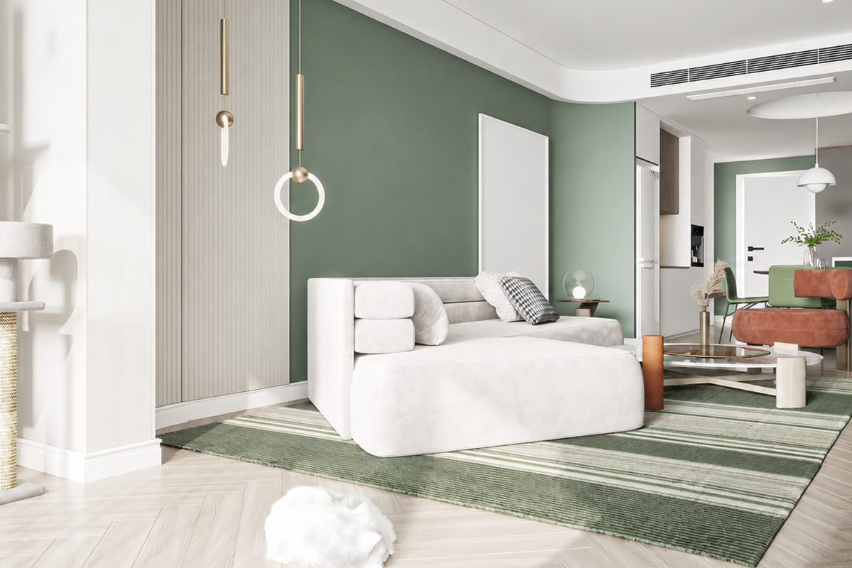
Consider the colour of your flooring. Pale floors like those common in newer Singapore apartments can support darker or more defined rugs easily. Darker floors often benefit from something lighter or warmer.
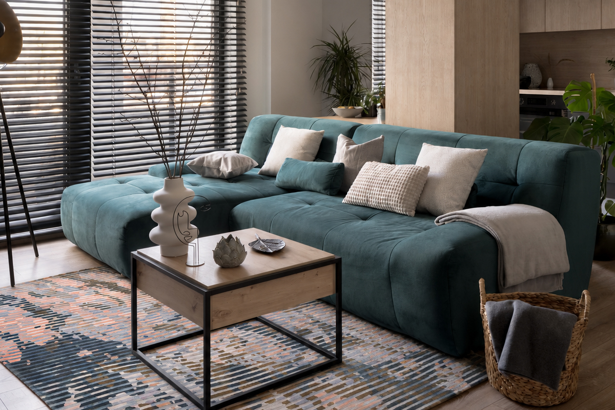
If both the sofa and floor are mostly neutral, you may be able to pull off a patterned rug. Texture plays a role here too. A rug’s pile and weave can actually make a palette feel warmer or more grounded than the colour alone would manage.
Consider Carefully Between Plain, Tonal, or Patterned
A plain rug isn’t automatically the safest option. Sometimes, you need a tonal rug to add quiet depth without visual noise. Sometimes, a patterned rug is the answer because it establishes relationships between several colours.
Plain or low-contrast rugs actually work best when the room already has a lot happening. If you have busy furniture or a lot of artwork, for example, plain rugs tend to work best.
Don’t forget to assess how much of the rug will be visible under your furniture too. A large and bold pattern mostly hidden under a coffee table reads differently from one on full display.
Bringing It All Together
The best rug colour palette begins with a look at the room you already have, followed by a look at what you want to achieve.
What are your existing anchors, the role the rug should serve, the undertones in the room, the lighting considerations, and the contrast or colour that fits your target mood?
Answer these queries and you can find the perfect rug to make different furnishings feel like they were always meant to be in the same room. In most cases, you might have to get something created just for you. This is because it’s easier to make a rug that fits your case than find one off the shelf.
Reach out to us if you need advice or artisans to design and craft such a rug. Our bespoke consultation service can guide you from colour and pattern all the way through to size and material.